Squirrel VR is a virtual reality personal project of a peer in my graduate virtual reality class. As part of the course, we were required to develop and present a VR project of our choosing. I chose to help my peer further develop his project from a sandbox to a full demonstration and tutorial level, and to conduct user testing in order to gain general feedback on controls and level design. I had no experience working with or developing user testing for VR, and had done little work in user testing for games more broadly. This project allowed me an experience to dabble in these areas!
As my partner had already developed a sandbox, mechanisms and a vision existed on his end. I worked to understand his goals for the semester, and how I could best help. He was most interested in coming up with a tutorial level. His desires were that it be open and allow for various engagement mechanisms, but still encourage players down a distinct path that would engage them with each of the game’s controls and allow them to reach a finish line. Collectibles as incentives to explore were also desired.
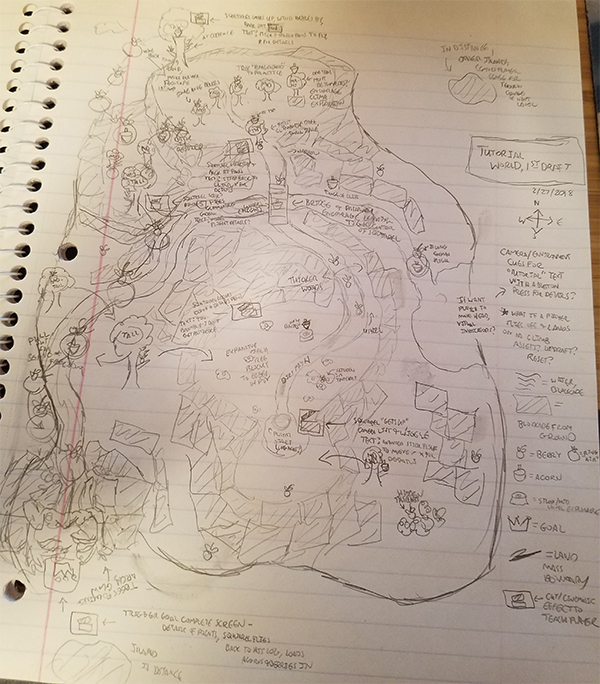
Given a general overview of the controls and these desires, I set to work in planning an initial level design. While I had little experience in level design, I used my knowledge of games and of user experience design to create an initial map of a level.
This map sketch highlights potential collectible locations, barriers, set pieces, and spaces designed to teach players about a new mechanic. Collectibles were divided into two types. The first collectible type was “berries”, a common collectible designed to encourage basic exploration and aid in navigating to “new areas” of the level. The second was “acorns”, a rarer collectible that required deeper exploration and interaction, more in the “Easter egg” style.
At spaces for learning or exploring new mechanics such as climbing or flight, a cutscene icon was used to indicate breaking into a tutorial of that mechanic.

After discussion of this first level design draft, a new requirement was revealed. It was also important to my partner that the tutorial elements in the world not pause the game in any way. My partner wanted the player to never be stopped from interacting with the world in any way. Cinematic cutscenes that guided the player to engage with the mechanic and demonstrated it were now out of the question, and a new UX problem presented itself: how do we teach the player the mechanics without stopping the game, and without walls of text?
My solution was also timeboxed: we only had a semester (alongside other courses) to complete our project goals, and thus, approaches had to be scoped accordingly.
While we did not have time for 3D modelled persistent videos that the player could move around to get a sense of button presses and motion, we did have time for me to create small graphical animations.
I referenced squirrel movements and sketched these alongside a moving Oculus controller with the button presses highlighted. The movements shown on the squirrel indicated the expected outcome of moving and pressing the controller in the indicated way. This also helped to “make sense” of some of the button controls, as methods of movement such as “gripping” the ground to pull forward may have felt unintuitive but were not in talks for modification.
These images then displayed in the overworld at areas of interaction. This allowed the player to enjoy the world without the tutorial images ever-present, but readily available through the press of a button in the relevant areas.
Once the tutorial level had been built (largely fitting the original design sketch), I began designing a user testing plan and recruiting participants to test the level and provide feedback.
My user testing largely focused on enjoyment, desire, and mechanics. Did users have fun, and what aspects frustrated them? What would they like to see as development continued or refined in this design? Which mechanics were intuitive or enjoyable, and which were difficult to execute?
In addition to gaining this feedback from the users after they played for some time, I also observed them while they played to note concerns, time taken on tasks, and visible markers such as difficulty finding buttons, getting “spun around”, and so on. Taking outsider observation of them at time of play alongside the user reflections presented a broader picture of the testing scenario.
In addition to the tutorial images, level design, and user testing, I also created some simple storefront and application graphics.
In game, I also created quick resources for a gold, silver, and bronze medal symbol when players cross the tutorial level finish line.
These quick graphic elements were small requests, but added a lot of impact for our final project outcome in class and any potential future iterations that could result in an app store release.
Overall, working on design and user experience testing for the Squirrel VR game was exciting and different from anything I had done. It used enough skills to be familiar, but the world of VR was a very distinct space to work in. This was a fun project to work on, and had me excited for potential future work on this project!


