For my master’s in Human-Computer Interaction capstone project, I chose to explore proposing a redesign of my employer’s mobile app for the “Mile of Music” music festival. Mile of Music occurred every summer in the local area, and featured downtown venues hosting indie bands and artists for a weekend of live shows.
I began the project by considering my personas. Who was using this application, and what goals might they have? I ended up with 4 personas capturing: a music fan, an area business networker, a friend within a group, and a traveler visiting the local area.
After developing the user personas, I also wanted to ensure I considered the stakeholder personas and their goals. While the app should of course benefit visitors to the event, stakeholders had desires in building the application, especially given it was a pro-bono project. The stakeholder personas I envisioned were a performing band, a downtown bar owner, a developer at my employer, and an event organizer for the festival.
With several users and stakeholders in mind, I began working to understand the application through various interviews. I spoke to an event organizer, developers at my employer, and spoke to developers who were also avid festival goers about their experience as users of the application and attendees of the event. I also looked to my husband for advice as an avid music fan who had yet to attend the festival – a fresh perspective from someone who was not pre-disposed to any existing format.
Based on these interviews, I considered existing path flows for the application, and how these may be revised for accessibility and interest. I also worked to consider how new and valuable features for both users and stakeholders could be incorporated into this redesign. This resulted in a low-fi prototype of a proposed re-design.
The proposed redesign not only had modified paths, but incorporated the following features based in persona and interview research:
- A search filter that provided various features from days of the event and subgenre to help users find relevant information faster.
- Artist favoriting, in order to manage not just shows attended, but artists enjoyed.
- Similarity search, in order to find artists “like this”
- A “heat map” of hot spots and artists, to be able to locate the action based on the app’s GPS
- Social media sharing features
- Ecommerce links embedded in artist pages if they have a merchandise shop
- Phone notifications for festival updates and show start times. This would include not just a notification but a “card” like feature to show maps and distance to shows.
- Tentative scheduling for favorite artists to see festival schedule layout for artist combinations.
- A “near me” GPS feature
- Increased backlinking and paths for user flow
- Better labelled and clarified interactions and behaviors.
In order to actually assess the utility of this redesign, I conducted user tests comparing the new low-fi prototype to the existing application flow, also set up as a low-fi prototype. I wanted to ensure that the control and intervention were not muddied by aesthetic factors, so both were brought to the same fidelity so that features and flow were the focus of the testing.
Proposed Redesign:
Existing Design:
Based on the user testing activities, the proposed redesign was favored unanimously over the existing design. User testing was conducted with 11 users, and involved a think aloud protocol, pre and post interview/discussion, and various tasks one might expect to complete during the festival.
More statistics and information about the testing can be found in my Mile of Music Capstone Presentation Slide Deck (PDF)
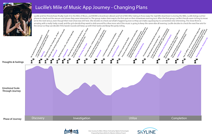
In order to better drive the value of these features, after completing the redesign and testing, I worked to develop realistic user journeys with various features of the application for distinct personas as well. This helped with selling not only that real users enjoyed and could navigate the new design, but that in context, it appeared valuable to real needs and scenarios.
I was very proud of my work on this project, and my capstone presentation was well received by the masters committee. This project was one of my first chances to really “carve” a UX process pathway from start to finish and create my own testing protocols. I’m so happy with what I learned in doing this project, and pleased with the results!


