Around 2016, I became interested in the “low-poly style” that was very popular among indie video games and some areas of graphic design.
However, this low-poly style requires 3D rendering to achieve. While 3D rendering is certainly something of interest to me, I simply did not have the ability or time at the time to devote to learning that skill for a graphical style when I did not have a particular project to put it toward.
Instead, I practiced and found a lot of fun in achieving a “faux” low-poly style. This only required an image, which I then “drew” the polygons over.
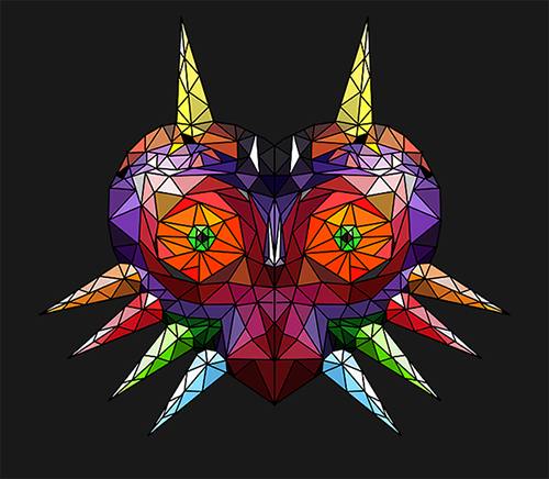
The example to the right is the first image I did in this style, a “faux poly’d” and colored version of Majora’s Mask from The Legend of Zelda.


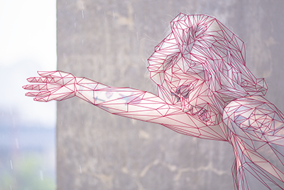
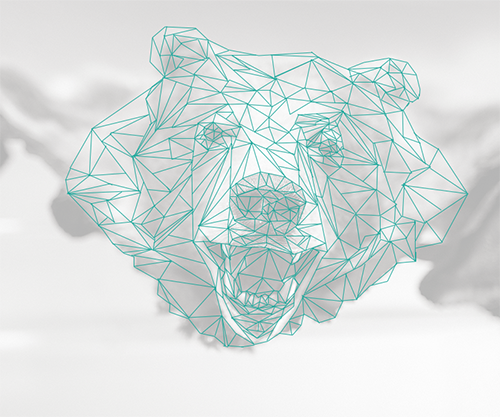
This image of a girl, and the image below of a bear, are two more stock images I practiced with after.
The image is faded underneath so the aspects “informing” the poly design can show through.
While I certainly still have an interest in learning more about true low-poly design, finding a work around that still looks intriguing and is fun to do was an exciting result as well!


