In addition to working on designs for my personal website, I’ve also worked on designs for my video game streaming channel as well. This gave me a relevant space to work with some of my “dark modern fantasy” motifs that appeared in a style sticker sheet I created before adopting the light “magical girl” theme for the website. Given that gaming themes and imagery often take on a bit more “edgy” design, it fit very well to incorporate those styles into the branding.
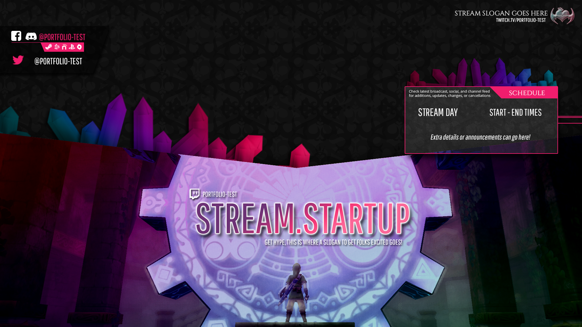
The channel design leans a bit more modern and of course in “dark mode”, but clearly incorporates themes from Swear Studios branding such as font family, accent colors, crystals, and the “winged heart” concept (though a bit differently imagined). The channel is a personal project not directly affiliated with Swear Studios, but given the Swear branding is so personally tied, it was great to find a fit for some ideas and assets in a personal branding effort.

Working on the channel required me to design for not only a different type of space, but also to consider design in new mediums and learn new skills.
The channel is part of a video live streaming platform, and so designs included various screen layouts for video content such as intro and finale screens, as well as overlay elements that were persistent across various scenes. In addition to elements in the video production, I designed other channel page elements such as the banner and static info boxes.
I put a lot of effort into learning the OBS Studio tool and the capabilities I had with scene layout. Just like my progression with the Studio branding, it took several iterations for me to arrive at something that felt comfortable and clean but still showcasing personality.


I went from a very box based layout that had lots of text and segmented components on my main scene to primary branding being a simple bar along the bottom and a social box underneath my web cam. I’m happy that despite downsizing the amount of graphical branding in order to keep focus on the video, the personality still comes through.
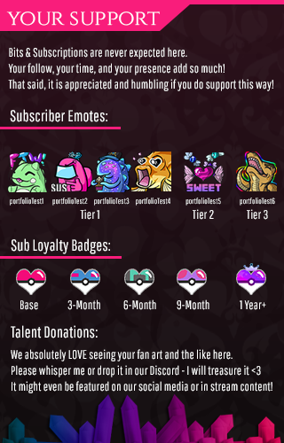
Streamers are also allowed to upload emotes, which their viewers can unlock and utilize in chat and across the site. In addition to designing my stream video and channel page elements, I also drew my own emotes. Emote designs were often based on stream jokes and our gameplay library.
Emotes have also gone through frequent iterations and revisions – I finally feel I have some comfort in designing them, though I’m certainly not a pro by any means! One of the largest challenges of emotes is the smallest necessary size for users to include them alongside chat messages. I frequently have ideas I feel will translate well in a tiny 24x24px space, only for the image to be muddy and indecipherable once downscaling to that final smallest size is finished.

In addition to emotes, plenty of other site elements are able to be customized on your channel in order for users to have a personalized experience there. I have also created loyalty badges and cheer badges that appear next to users in chat who have supported the channel through the platform’s built-in support methods.
The page also features several sections detailing what the channel is about, our schedule, rules, and so on. In order for the page details to match the branding, all segments are designed into text images, such as details about supporting the channel. For me, this is one of the limitations of the platform – I would like to be able to design this with basic HTML and CSS so that the content is accessible. Without the image version though, you are limited to essentially plaintext and a single header image with no alt text for each section. As much as I dislike the lack of accessibility in an image-based solution, weighing the options this was the best approach to keep the page from being inaccessible due to information overload from a lack of design features as well! I worked to incorporate necessary information like schedule and rules in text based forms elsewhere such as user-accessible chat commands or other built-in widgets on the platform.
I had no experience working with video design prior to working on this channel, which made it an interesting space of blending new and old skills. Many things I had done before were useful, but I had to use those skills in new ways, and think about design for a new medium. I also ended up learning a lot about video production and tools, skills which had not even been on my radar prior. I went from simply being happy I could get the game, a camera, and audio to coexist to having multiple scenes and creating multitrack recordings for potential future use. I even began attempting to learn Premiere in order to make my own video-based design elements, such as a custom stinger transition to move between scenes.
I’m quite proud of how far I’ve come applying my design skills in a different way and continuing to grow and expand my skills as part of working on my video game streaming channel. I look forward to seeing how these skills continue to grow!


