One of my biggest wishes with Swear Studios was to have each page’s design be able to tell a story. There is some gorgeous and evocative stock photography out there, but the heart of Swear always ran deep with fantasy story themes I had conjured. I knew illustration was what would best evoke the fantasy I wanted for the website, but I felt stuck in being able to have my artistry deliver the ideas I envisioned.
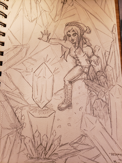
In October of 2019 I took part in the challenge of drawing a picture every day, using a list of themes I had created that seemed intriguing. I started off only certain of what the first four images should really “be” – the story line of a young woman on an adventure who finds a crystal that helps realize and unlock her magical potential.
I had made several attempts prior to this challenge to draw the first image, “Discover”, and none were even remotely close to captivating in the way the “picture in my head” was. Something about this challenge though flipped the switch – while the picture wasn’t the original composition I had in mind, it turned out better than I could have hoped, and was one of my more dynamic drawings in terms of movement. This was surprising, given how little time I had been able to devote to drawing because of graduate school!

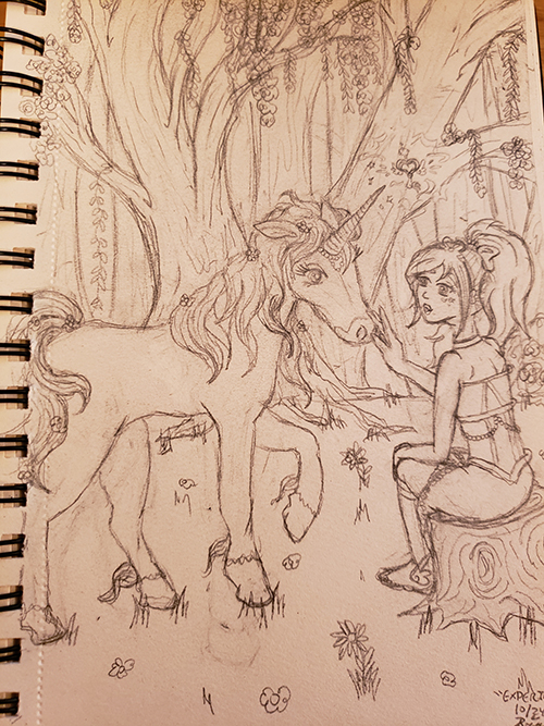
The surprises continued to emerge for me as I carried on with consistent drawings each day. What had originally started as a small routine to get me back into practice became one of my largest endeavors and some of my most fantastic drawings yet. I was stunned at the progress I made through the month and the ways I pushed myself. I used reference more judiciously and consistently, and explored poses and compositions I would have been terrified to try prior.
While by no means are these drawings perfect, I was astounded at my growth and ability to step outside of my usual bounds with some degree of success. I completed a drawing for each of the 31 days, and even did a few “mascot style” doodles after.
Of course, sketches were only half of the battle – website banner art requires digital composition to work well!
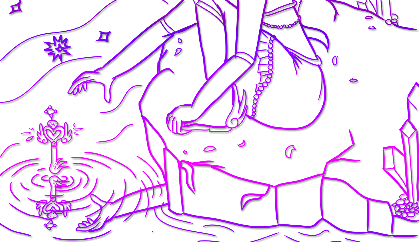
While I am still working through digitally inking each of these drawings, I am also proud of the growth I’ve had in my inking capabilities from this project. I grew up using Photoshop, and was more comfortable with it as a result. However, I wanted crisp vector lines to be able to scale and work with my sketches better. As a result, while I had inked prior in Illustrator, I was also invested in growing that skill.
My art isn’t perfect, but I certainly feel that my inking skills have grown as well. I used to feel that whenever I inked a drawing, some of it’s “soul” was lost – the fine detail in some of my lines or the light shading a pencil gave fell away, and the result was flat and lackluster. I truly wanted better for these drawings so that I would feel happy seeing them around my site – and that care and dedication I feel showed through in a growth in my digital line art.
I grappled with “to color or not to color” the art for quite some time. While I think it would be interesting to explore color at some point, I also felt that the line art nature kept the focus on the art and the page design consistent, rather than fearing color composition would take away from the banner narratives.
I hope you’ve enjoyed seeing these designs on each page. They tell the story of a girl realizing her magic and using it to help others while growing herself. It’s a story that resonates with me – and with the desire I have for this studio.


