As a UX designer, one of my favorite ways to introduce or explain scenarios is using comic storyboards. These storyboards utilize persona-based characters in order to illustrate a need for or interactions with the product or key idea. As I’ve transitioned from an industry designer to an academic researcher, I’ve continued using comics to showcase problem spaces that invite research questions, or hypotheses and observations from the research.
One such comic that appeared quite frequently throughout my time obtaining a PhD was a comic of a student and teacher discussing code dependencies. My PhD research explored analogy, and I wanted to better pitch the hypothesized benefit of the ability to follow and better remember information presented in this form while one is learning.
This comic appeared on posters presenting my proposed PhD research, which gave two major benefits. The first: explaining my work using an easy-to-follow visual analogy (thus, using principles of the work itself!) made the work more inviting for poster viewers. The second was that the comics are fun and novel for a poster session, which got folks interested in coming to see my work and hear more!

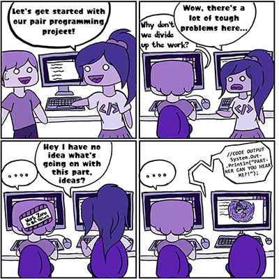
The first comics I created for academic research helped explain observations we had from the pair programming behaviors our students had in their lab sections. The initial four panel comic explains a situation students often find themselves in when they do not establish collaborative pairing habits – the lack of shared context and flow on one’s own work separates them, and they do not gain any of the learning benefits and support that collaborative pairing provides.
The next four panels of comic featuring the same characters were designed not as a progression four panel comic , but are showing four variants of pairing behavior we observed – hence their individual creation rather than immediate combination as a whole. A single panel can then be isolated and used when describing one pairing behavior, or all can be combined into a four panel image to show the subset of interesting behaviors we observed. These panels show both partners showing their computers, which can be seen to have different information on the screens in accordance with the “roles” we observed each taking on. This helped to identify that not all students pair program in the exact way pair programming is described, and to better illustrate these behaviors.
The pairing behavior comics were used in poster presentations as well as conference proceeding presentations.
I have not only used comics in research settings, though I do use them much more frequently in academia. During an internship in my undergrad, I took a Coursera Human-Computer Interaction course in the evenings which incorporated the use of several UX “toolbox” elements into the course deliverables. I created two scenario comics for WatchDog, an application I was proposing to help make walks home safer.
My first comic illustrated a “photo save” feature which prompted for a photo to be tagged as the most current appearance of a user. If the user of the app triggered an alert or close family and friends reported them as missing, this photo would then be distributed in the hopes of helping them be spotted more quickly.
The second comic illustrates a noise deterrent feature that is able to be operated from a user’s pocket without looking at their screen, in order not to draw suspicion. Triggering the deterrent could also be set to alert selected friends and family that this person had activated an alert, ensuring that loved ones were aware to check in that they were okay.
These comics were the first record I have of creating a persona-based use case storyboard for UX design. I actually still use them as examples frequently when presenting on UX tools and communicating ideas and software design to stakeholders!
As an academic, my research on analogy in computing education has also opened the door for even deeper use and analysis of comics and storyboards. Comics as a visual representation can be used to communicate ideas analogically, and communication of understanding is necessary in educational contexts.
A researcher team I am part of at my institution is currently exploring the potential values for educators and learners of comic-based work as an assigned exercise. I have also previously discussed the intersection of comics and my research on analogy with computing education researcher Sangho Suh, whose PhD research has focused on comics for programming learners. Together, we collaborated in taking concepts from my analogical design framework to design a comic that reflected a programming scenario for the study-design of comics alongside code snippets he was exploring.
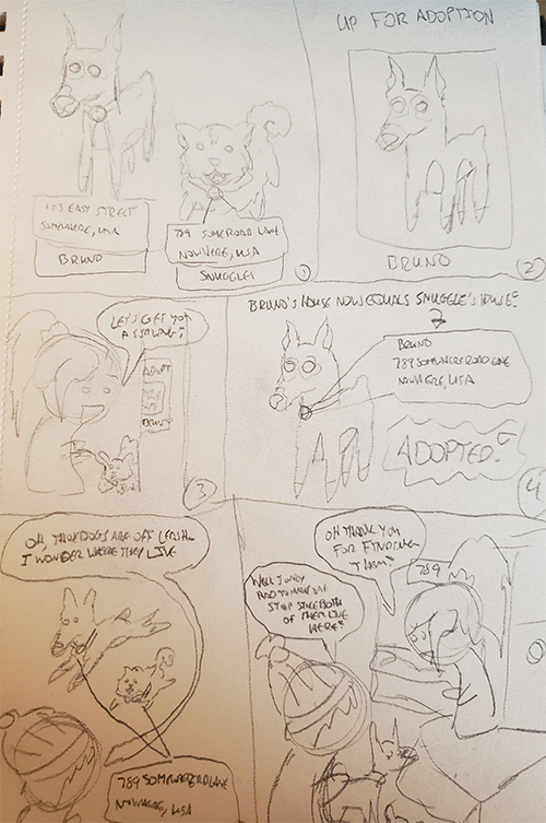
The sketch here shows a (very) quick draft of a comic explaining aliasing of reference types modifying memory location as an analogy to a dog’s collar showing a new location as it is adopted by a new owner. This sketch was then passed over to Sangho’s team, who developed a finalized version of the comic that fit the artistic style of the team’s overall comic work.


